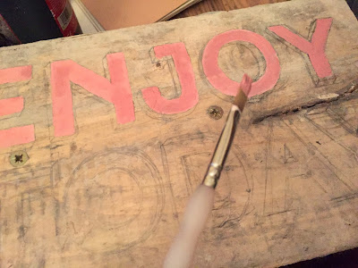
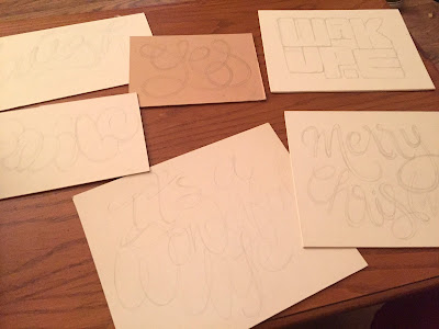
Site specific typographic design; positive uplifting message that would not have as much meaning if separated from this context.
Tested out practicing using different tools on different surfaces, from large permanent marker pens to smaller pens, paints, and paint markers. I used different thicknesses of paper, card and wood as canvas as well as writing on found materials, some a part of the city already such as wooden posts.
I was able to leave the wooden pieces of art work in public spaces for the audience to engage with, being open to the idea of people participating in the visual signs of public space by moving or changing the arrangement of these pieces.
Some styles worked better than others in communicating the message. The above blackletter face didn't work as well as the sans serif in lighter less harsh colours. Positive messages need to be displayed in a suitable typeface and colour that evokes positive emotions.
I attempted several different styles of hand written typography and lettering, each specific to the message/word. Done on fairly thin card with the intention to stick on flat surfaces around Leeds as a form of temporary art. Due to the unprotected surface of the painted cards and low quality adhesive to stick down the chances of pieces staying in their original place for long aren't high.
Some words I wrote with to test out were simply just positive in nature such as 'yes'. There is no key indication to what it's saying yes to, this element is left for the audience to decide for themselves what it means, particularly in relation to them. One painted on wood and one on card, they have different levels of durability and are written in different styles, one in continuous, overlapping line and one in block letters with metallic and colour ink.
During the Christmas period I stuck a 'merry christmas' hand drawn sign in the centre of Leeds, with the hope that it would be seen by christmas shoppers in the area. Coming back to the same place after the festive break showed the sign no longer there, not unexpectedly. Whether it was removed in person or due to weather conditions or lack of secure adhesive I will never know, which is part of what I like about the ephemeral side of the project.
Another card up in Leeds city centre. I chose a space between two shops on a dark brown background which framed the rectangular piece. The colour also compliments the colours I've used, and it almost blends in as if it becomes part of the space.
(mid December 2015)
When I returned a few weeks later to this spot this piece is still up on the wall despite weather conditions and ability to be taken down manually:
(January 2016)
Some other pieces I placed around Leeds include messages that also invited the audience to take meaning from themselves. The woodblock piece was placed on a park bench, and obviously no longer exists there so is hard to know where it may have ended up.
I also experimented with different forms of graffiti such as stickers, using space to write positive messages inspired by existing projects I've researched, and ones found in my primary research.
More wood block writing:


